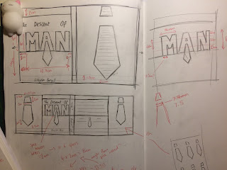
In the initial designs, I was communicating quite a literal representation of the books theme. Exploring things commonly associated with masculinity and the ways we interpret it.
After a group discussion where we reviewed and discussed one another's work, I decided to try and take a subtler approach. To do this, I decided to focus on a smaller feature and create a more graphic finish. I decided the tie was a good way to go as it has such connotations with manliness, something that can instantly suggest to somebody what the book is about.
After finalising my idea on paper, the next step was to take things onto illustrator where I produced a properly scaled final cover. The process was quite long and I'm sure that I didn't really go by the book. But it was a really helpful process as I managed to figure out things I previously was unable to do with the software. It helped me gain a greater understanding. I completely forgot to capture the screen during the development of this idea, so annoyingly have nothing to refer to.
In regards to the colour I used, I purposefully didn't choose a colour that has an association to a particular gender. A large part of Perry's point in the book relates to the unhealthy expectations we have of someone depending on what their genitals look like. So going for more neutral colours was something I felt necessary.
One part of this piece that I feel quite proud of is the way I managed to unify the 'A' with a tie, it hopefully makes for quite a simplistic but bold statement about the book. Here is the final:
Overall, I've really enjoyed this project. It's been fun producing a piece of illustration that feels more closely connected to graphic design - something that I am interested in.


