
This brief seemed incredibly daunting to begin with. Having so much scope to navigate, there was definitely a few times in the beginning of the year that I feared I'd never be able to come to an idea that I liked. I think the reason I always find the beginning of any project hardest is due to there being so much room for change, development and improvement. That intimidates me sometimes, as it often feels there's too much to do and comprehend which can get my mind into a bit of a muddle.
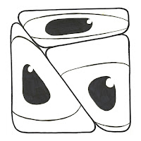
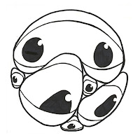
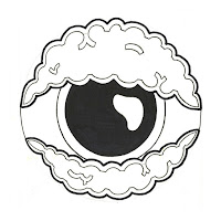
Saying this, I did actually really enjoy getting to know Sacks, and have found myself to be quite a big fan of his. Reading through his autobiography was a particularly insightful experience as it gave such a rounded and informed depiction of him. One aspect of this book that I attached to was the case studies he included, particularly those focused on hallucinations and being out of touch with reality. This theme started to make its way into my work as I started trying to make sense of his case studies on paper, which was very difficult. I eventually started drawing eyes in many ways and using them as a means of expressing the mind. Seeing as it's our main portal to perception I found it quite a fitting motif.
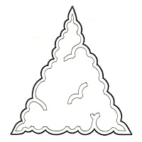
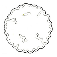
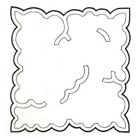
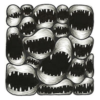
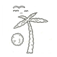
After developing these ideas for a few weeks we had the opportunity to discuss our ideas with one another during a crit. I found the feedback to be really constructive and useful. It confirmed some of the thoughts that I had already had, as well as pushing me to think a little outside of my comfort zone. This is evident in the motifs that I decided to choose for my final 3. Prior to the crit I was more or less set on using the brain/eye combinations. But hearing what my peers had to say about my other designs (highlighted above in red) really helped to steer me in the right direction.
The process we used to gather feedback in this crit was particularly useful as it resulted in a well rounded bit of information that I was able to incorporate into my next steps.
I am happy with the style that I opted for in my final motifs, using very bold and graphic outlines in my designs really helps to push the images, helping them to stand out and have a presence. Considering this, I think it would be great for Studio Brief 2 if I was able to create clean and bold vector artwork from these ideas. Which then has the ability to be translated into print and manipulated further.
Overall I feel happy with the work I have produced during this brief, I do however think there are a few points to take note of into the next stage:
- Experiment with manipulating digitally, see how traditional processes can be combined with this.
- Allow your ideas to flow more and be more confident in the work that you're producing. Don't expect an idea to fall from the clouds!
- Keep aware of the message you are communicating through your work. Don't stray away from your ideas.
- In hindsight, it would have been a good idea to experiment with a few more processes and medias in this stage. Using collage could have helped to generate a range of ideas in a short amount of time.
- Maybe collage could be incorporated into the printing stage of the module?


