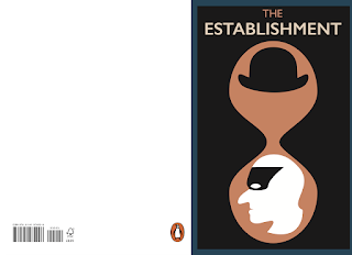
Whilst playing around with this concept on illustrator, I ended up using a grid of circles to creating a clipping mask over the profile image of 'The Establishment'. The effect that this gives is quite abstract but interesting. The grid helps to communicate structure which effectively is what 'The Establishment' is in control of, the structure of our society.
Using the circles in this way then led me to try experimenting with merging the shapes and using that to hold the other motifs. The image below starts to resemble the process of cell division (in my eyes at least..). This could be a good way to suggest the subject of the book. In the particular image below, with the hat and the head separated, I'd assume that this is portraying a crack in the armour of the establishment.
In the images above and below, I started to get a little more abstracted. Removing the profile and restricting the imagery simply to the mask and hat. Contained in a dividing cell like structure. And then using a larger grid of much smaller circles I created a clipping mask of this. I think that containing this image in the circles like this works really well. It suggests toward the structure and power that The Establishment holds, but in a way that's not initially clear.
The previous images show the more finalised versions of the front cover. Eventually decided upon using two fonts. This allowed me to ensure that the word 'Establishment' would really boast itself from the page and make a clear and sudden impact on the viewer. The radial gradient I placed between the hat and mask is there to suggest a fault in The Establishment. Having a book such as this which opens peoples eyes to their goings on is one example of a way in which The Establishment is losing it's armour. Knowledge is power!
A theme I wanted to see continued over the whole spread was the inclusion of circles in an organised fashion. I decided to create the spine using a clipping mask of this arrangement of shapes, as that way I could visually link that around to the back cover.
Placing the circles on the back in this way starts to suggest disorder and a sense of chaos. Especially in comparison to the neatness of the arrangement on the front cover. Problem with this design is finding a way to ensure that the text is legible and there is space for barcode etc.
The image above is where it's all starting to really come together! Am happy with the relationship between both pages in this design. Using the merged circles to create space for the reviews works well and communicates a sense of disruption in the order that was once applied to the circles that the viewer will have seen on the front cover. After a meeting with tutor the other day think it would be good to try and incorporate some colour somehow into the back.
In the images above, I decided to use the original 'Pelican Blue' that was used for penguins non-fiction books.
Above are a selection of colour variations. I think that the initial blue is what I am going to stick with though. I'd like to have been able to find a way to properly incorporate the circular gradient like effect in the purple and orange images above. However, I was not able to do this effectively without losing quite a lot of detail.


