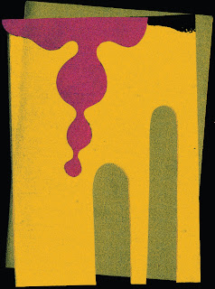
Here is the finished print out:

I decided to limit my book to one piece per double page spread. The reason being that it allows for less distraction from each of the images. I found that with multiple images it became cluttered and harder to view. Another decision that I had to make was the bleed. I decided on a full bleed in order to maximise the amount of image that could be displayed. I ended up using a staple bind but think it would have looked nicer had I stitched it, this would've given a more authentic feel.
In terms of the imagery I produced I am happy, I want to continue exploring music and visual art in this way and see where my work could take me - this is potentially something I could focus on as a personal project over summer.
Another thing I'd like to work on after struggling with it a bit when constructing my book, is layout. The contents page I produced could have looked a bit better I think, so i'm going to practice this a bit.
Illustrations used:


There isn't much of a flow between each of these images, but the reason being for this is due to their being a large difference between everyone's choice of music and their reasoning behind that. It's a deeply personal relationship and so each of the images essentially tells its own story. For example, in the bottom left image for a song, 'My Mind' by YABBA. There is an emptiness and muteness displayed through the choice of shape and colour. Whereas in the image above, produced in response to a song by the Black Eyed Peas, there is a lot more colour and movement which reflects the piece of music it is linked to.


